New Google "Search Results" Bar
I recently got put in a test bucket for Google's new layout with a "search results" bar near the top of the page. Generally this impacts the search results in a couple ways:
- First off, it is a much better looking design. In the past when the search results would move up and down with Google Instant it really felt like a hack rather than something you would see on the leading internet company's main website. Now with the results fixed it feels much cleaner & much more well put together.
- The more stable basic layout of the SERP will allow Google to integrate yet more vertical data into it while making it still look & feel decent. Google may have localized search suggestions & the organic results for a significant period of time, but the combination of them with this new layout where the search results don't move feels much more cohesive.
- To get the white space right on the new layout Google shifted from offering 5 Instant suggestion to 4. The Google Instant results don't disappear unless you hit enter, but because the interface doesn't change & move there isn't as much need to click enter. The search experience feels more fluid.
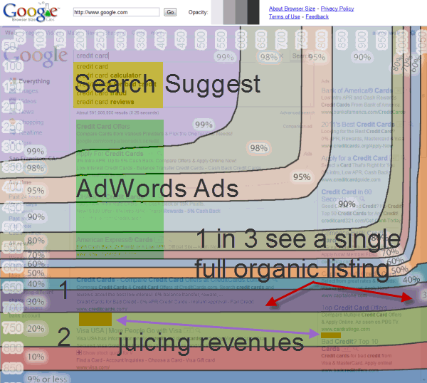
- The horizontal line above the search results and the word "Search" in red in the upper left of the page is likely to pull some additional attention toward Google's vertical search features, helping Google to collect more feedback on them (and further use that user behavior to create a signal to drive further integration of the verticals into the regular organic search results).
- On the flip side of this, in the past the center column would move up & down while the right column would remain stationary, so I would expect this to slightly diminish right column ad clicks (that appeared at the top even when the organic results moved downward) while boosting center column clicks to offset that.
- In the past, when Google Instant would disappear from view, that would pull the center column organic results up a bit.
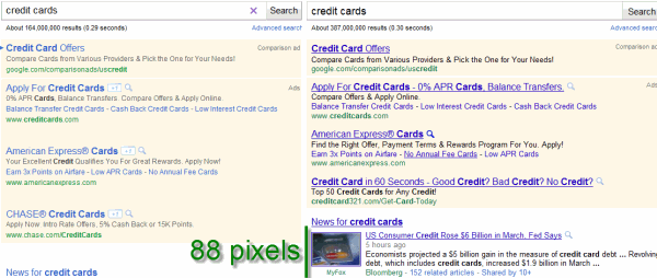
- This always-on bar shifts the pixels above the first search result from about 123 to 184...so roughly 60 pixels downward.
- As a baseline, a standard organic listing with no extensions is about 90 pixels tall, so this moves the search results down roughly 2/3 of a listing, which should drive more traffic to the top paid search ads & less to the organic results below them (offset by any diminished clicks on the right column ads).
- This is a much cleaner way of taking advantage of white space than some of the cheesy & ugly-looking stuff they recently tested.
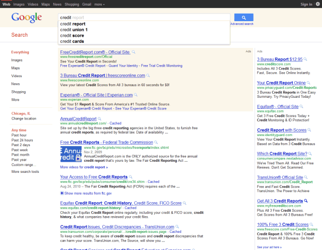
I tried to line up the results pretty closely on the new test results to show what they look like with Google Instant results showing & after you hit enter. Scroll over the below image to see how the result layout doesn't really change with Google Instant hidden or extended.
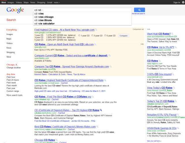
And here is an example image showing how the location is sometimes inserted directly into both the organic search results and the search suggestions.
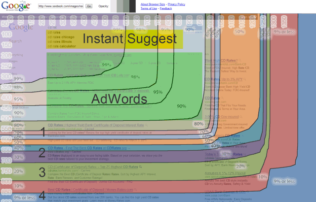
Here is an image using Google's browser size tool to show how end users see the new search results. Note that in this example I used a keyword where Google has comparison/advisor ads, so in markets where they do not yet have those you would move all the organic results one spot up from what is shown below.
New to the site? Join for Free and get over $300 of free SEO software.
![]()


Once you set up your free account you can comment on our blog, and you are eligible to receive our search engine success SEO newsletter.
Already have an account? Login to share your opinions.


Comments
Add new comment