How To Lie With Statistics

There are three kinds of lies: lies, damned lies, and statistics - Disreli
We get presented with graphs and statistics every day. "Most SEOs think keywords in the title tag is an important ranking factor." "Spending on search to rise by $10b". Ever get that feeling that what you're being presented with sounds plausible, but the conclusion just doesn't make sense?
Here are a few common ways people try to pull the wool over your eyes with statistics. Some you'll be familiar with. If you've got more, add 'em to the comments :)
1. Built In Bias
The sample data supports an obvious agenda. For example, a company is hardly likely to show a graph that shows their product has produced negative results. Try to determine the bias of the person or organisation presenting the data - "what would they want me to hear"? then ask yourself: "what data are they not showing me?"
2. The Average
The media loves to state "the average", then neglect to tell you which average they are talking about.
For example, the average house price for an area could both be 500K and 200K, depending on what type of average is being used. They could be referring to either the mean, the median or the mode. They often mix these up, depending on what conclusion they want you to reach.
3. Inadequate Sample Size
20% of web designers make over $1M. That may be true if the sample size consisted of ten highest earning people in the industry, and two people just happen to have had a great year. But what if the sample size is all those who practice web design for a living? The outcome may be somewhat different.
4. Meaningless Differences
A difference is only a difference if it makes a difference. Potential employee Jill may have an IQ of 120, and potential employee Jack may have an IQ of 118, but does that really mean anything? What if Jill has an attitude problem, and Jack is a great conversationalist? Who would be the better hire?
5. Oh My God!
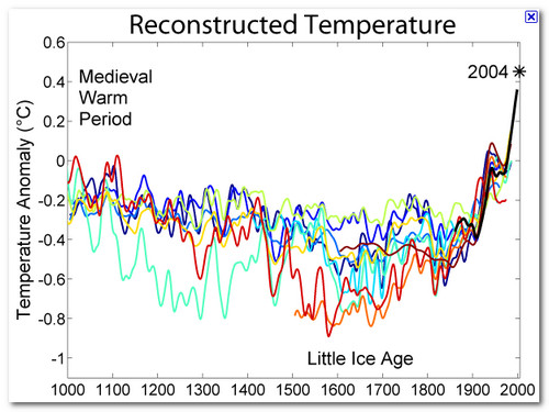
Al Gore loves this one. The graph that shows some astonishing change in the status quo. The impression is one of significant movement and is meant to shock an audience.
However, if the chart appears in a different context - say, over a longer time period - the rise may not look all that unusual. You often see this in stock price quotes. You could also change the measurement into smaller units, thus making any movement in the graph look even more impressive.
6. What You Infer Is Up To You
If you can't prove what you want to prove, prove something else and pretend they are the same thing. Often used in the alternative medicine industry. They may not be able to prove that their natural products cure cancer, but they can say that the plant extract has been used by some remote tribe, and they have a proven historical low incidence of cancer.
7. Post Hoc
A study found students who smoked got lower grades. The fallacy of one thing not following the other i.e. smoking doesn't cause bad grades. Frequently, other factors are left out i.e. the students who smoked also tended to be party animals. Look out for correlations that happen by chance.
8. Data Precision
Quoting specific numbers, especially including decimals points, can look authoritative. "Real estate values up 4.95%" Why would someone be so precise if they didn't know their stuff? The numbers can be wild guesses, but accuracy gives an air of authority.
General Tips For Spotting The Lies
- Ask "who says so?" Are they likely to be biased? If experts are cited, check to see if those experts actually agree with the conclusions. Often, they do not.
- Ask "How do they know"? Is the sample size really large enough, or relevant enough, to draw conclusions?
- Look To See If They Change The Subject. Look for a change between the raw data and the conclusion. Does one follow the other? For example, more reported incidences of crime do not necessarily mean there is more crime occurring.
- Ask "Does this make sense?" - are they trying to blind you with numbers? If the conclusion just sounds wrong, look for a disconnect between the data and the conclusion
If you want to delve deeper in to How To Lie With Statistics, grab the little book of the same name. It's getting a bit dated now - it was written in 1954 - but the advice and examples are great :)


Comments
This is awesome, I published something very similar on screening social media consultants - its on a popular auto industry blog.
Who's picture is better? :)
http://www.dealerrefresh.com/background-check-your-dealership-social-media-consultant/
Both good. :)
I like the one PeterD picked a bit more though...it has more personality ;)
This is the book that opened my eyes to sophisticated techniques used to manipulate people. I may have said this before, but it always deserves repeating.
My college statistics class was enough to show how easily they are manipulated.
Close reading and deconstruction are also techniques that are used in shaping public opinion and selling product. Good to understand.
PS - A good value system is indispensable in combating the BS. That way you will still be able to see the forest.
Yes, numbers are misused to give the impression that they are "scientific and/or objective". Stats is like a tool. Who use it and how use it matter and why use it. To educate , to forecast, to find a pattern or to persuade?
Some of people seem to abuse statistics to advance their hidden interest or misuse stats because of shallow understanding of statistics.
Anyway, because I love seobook.com, I would like to contribute a little what I learned in grad school. I have to check my stat books again though.
2) average: concerning arithmetic average that we use most as "average", a single extreme sample (or outlier) distort the value of arithmatic average. For example, if you calculate average income level in a place where Bill Gates happens to live, it will be distorted because of Bill Gates. Without him, the average will be dropped significantly. :)
3) seems to mean sampling. not "size". By "random sampling", the sample of population of interest (like webdesigners in U.S.) is selected. Here "random" means "each sample has equal opportunity to be selected".
Each statistics has its statistical assumptions and they are not fully understood even by the users. They don't know when to use and when not to use that statistics.
Be an educated consumer of stat.
Before you believe any data, check the source and what argument is supported by that stats. Produced by whom? government, political party, company, individuals...the scholars are no exception (they also make a mistake).
P.S. When I took stat courses in grad school, many of doctoral students got a C (failed grade for doctoral students). Fortunatley, I was not in that group. I hope those guys don't use stat in their job. However, stat is more beautiful than you assume if you try to know more.
If I have a chance, I may share more stat understanding with seobook.com visitors. Probably with forum members. ;)
Thanks.
Thanks cphong! :)
Thanx for your article,let me know more about the seo
When working as a linker a few years back, I managed to blag a great link from quite a big site after comparing stats with someone over the phone who clearly wasn't in-the-know. This person asked how many hits we received and I told him honestly; he was seriously impressed, almost salivating and wanted to trade links immediately. However, there is a clear difference between hits and uniques. I'm almost certain he didn't know the difference, since we had 4x as many hits! I didn't lie, but I guess you could call it bending the truth a little :)
Add new comment