Banner Blindness Extends Beyond the Banner
When looking at the difference between a profitable business model and an unprofitable one you really need to look at the math. I recently ran many graphic ads that I bought through Google on a CPM site targeting basis. Here is a look at one campaign: 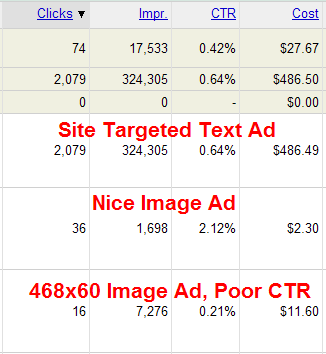
Notice that the 468 by 60 got a much lower click-through rate than the text ad or other image ad. Why? Some of it may have been up to ad positioning, but part of it is also due to 468 by 60 being the default banner ad size. If it looks like an ad people ignore it.
Just like the 468x60 banners are being worn out, many sites are selling overpriced 125x125 ad buttons. These are not selling because they offer great value, they are selling because the trend started at a few popular sites, and it is easy for the publisher to ask for a lot without giving away too much value.
Low value sites that feature targeted ads as the content (with in content text links) will earn more than high value content which has obvious ad units located in obvious ad spots.
And just how people grow sick of advertising they also grow sick and tired of abused methods and formats, such as:
- pop ups and other intrusive ads
- red headlines
- squeeze pages
- sensational headlines
If you want to make your marketing successful, leverage techniques that are not perceived as being overused and abused to members of your target market. Rather than formatting your ads like ads turn them into content that is formatted like other content people trust and get people talking about it.


Comments
Great article! - it reminded me of an eye tracking study we conducted on Amazon.co.uk's homepage. See http://www.etre.com/blog/2006/05/five_days_amazoncouk/
This research revealed how Amazon uses a very cunning sales ploy that leverages the unexpected to attract users to one of its offers.
Amazon knows that users arriving on its homepage will automatically look at the top left hand corner in search of the company's logo. Users do this on every site to confirm that they have arrived in the right place.
However, instead of placing its logo there, Amazon places a "FREE DVD TRIAL" advert in this space instead, moving its logo over to the right. In doing so, the company exploits users' expectations of how websites typically work.
During our tests, this little "trick" unwittingly exposed around 50% of users the DVD Rental campaign. Sneaky!
(We also did another study on Virgin's website that showed that users completely ignored a massive banner ad. See http://www.etre.com/blog/2006/04/virgin_on_successful/ )
Is it legal to publish the details on Impression and cost? I am not sure but I think it is against Google policies.
Nice write-up. I guess it's somewhat obvious that 468x60 ads' poor CTR due to banner blindness should've been more obvious to me given that it's perhaps the oldest display ad format but it's not something I would've considered until I read this article.
Adsense is where the trouble is. If google pays you they're strict... if you're paying them (adwords) they're less so. I think it's OK anyway if he doesn't reveal those details about a site or an ad.
Aaron, what were the dimensions for the "nice image ad?"
Hi Matt
I didn't want to share everything, plus it can change a good deal based on ad design and ad positioning too.
Add new comment