The 4 Fundamental Steps of Conversion Optimization

Once upon a time, I was sitting in my office looking over data for one our new clients and reviewing the conversion project roadmap. The phone rang and on the other end was the VP of marketing for a multi-billion-dollar company. It is very unusual to get an unannounced call from someone at his level, but he had an urgent problem to solve. A good number of his website visitors were not converting.

His problem did not surprise me. We deal with conversion rates optimization every day.

He invited me to meet with his team to discuss the problem further. The account would be a huge win for Invesp, so we agreed on a time that worked for both us. When the day came, our team went to the company's location.

We started the discussion, and things did NOT go as I expected. The VP, who led the meeting, said, “we have a conversion problem.”

“First-time visitors to our website convert at a rate of 48%. Repeat visitors convert at 80%!”

I was puzzled.

Not sure what exactly puzzled me. Was it the high conversion numbers or was it the fact that the VP was not happy with them. He wanted more.

I thought he had his conversion numbers wrong. But nope. We looked at his analytics, and he was correct. The numbers were simply amazing by all standards. The VP, however, had a different mindset. The company runs thousands of stores around the US. When someone picks up the phone and calls them, they convert callers at a 90% rate. He was expecting the same conversion rate for his online store.

Let's face it. A typical e-commerce store converts at an average of 3%. Few websites are able to get to anywhere from 10 to 18%. These are considered the stars of the world of conversion rates.

The sad truth about a website with 15% conversion rate is that 85% of the visitors simply leave without converting. Money left on the table, cash the store will not be able to capture. Whatever way you think about it, we can agree that there is a huge opportunity, but it is also a very difficult one to conquer.

The Problem with Conversion Optimization

Most companies jump into conversion optimization with a lot of excitement. As you talk to teams conducting conversion optimization, you notice a common thread. They take different pages of the website and run tests on them. Some tests produce results; others do not. After a while, the teams run out of ideas. The managers run out of excitement.

The approach of randomly running tests on different pages sees conversion rate optimization in a linear fashion. The real problem is that no one shops online in a linear fashion. We do not follow a linear path when we navigate from one area of the website to the next. Humans most of the time are random, or, at least, they appear random.

What does that mean?

The right approach to increase conversion rates needs to be systematical, because it deals with irrational and random human behavior.

So, how do you do this?

The Four Steps to Breaking to Double Digits Conversion Rates

After ten years of doing conversion optimization at Invesp, I can claim that we have a process that works for many online businesses. The truth is that it continues to be a work in progress.

These are the four steps you should follow to achieve your desired conversion rate:

Create Personas for Your Website

I could never stop talking about personas and the impact they have on your website. While most companies talk about their target market, personas help you translate your generalized and somewhat abstract target market data into a personalized experience that impacts your website design, copy and layout.

Let's take the example of a consulting company that targets “e-commerce companies with a revenue of 10 million dollars or more.” There are two problems with this statement:

  • The statement is too general about the target market (no verticals and no geography, for example)
  • I am not sure how to translate this statement into actionable items on my website or marketing activity

You should first think about the actual person who would hire the services of this consulting company. Most likely, the sales take place to:

  • A business owner for a company with annual revenue from 10 to 20 million dollars.
  • A marketing director for a company with annual revenue from 20 to 50 million dollars.
  • A VP of marketing for a company with annual revenue over 50 million dollars.

Now, translate each of these three different cases into a persona.

So, instead of talking about a business owner for a company that is generating annual revenue from 10 to 20 million dollars, we will talk about:

John Riley, 43 years old, completed his B.A. in physics from the University of Michigan-Ann Arbor. He is a happy father of three. He started the company in 2007 and financed it from his own pocket. His company generated 13.5 million dollars of revenue in 2014 and expects to see a modest 7% increase in sales in 2015. John is highly competitive, but he also cares about his customers and thinks of them as an extended family. He would like to find a way to increase this year's revenue by 18%, but he is not sure how to do so. He is conservative when it comes to using new marketing techniques. In general, John does not trust consultants and thinks of them as overpaid.

This is an oversimplification of the persona creation process and its final product. But you get the picture. If you are the consulting company that targets John, then what type of website design, copy and visitor flow would you use to persuade him to do business with you?

What data points do you use to create personas for your website? I would start with this:

  • Market research
  • Demographical studies
  • Usability studies
  • Zip code analysis
  • Existing customer surveys
  • Competitive landscape
  • AB and Multivariate testing data

A website or a business should typically target four to seven personas.

Add Traffic Sources

So, you have the personas. These personas should impact your design, copy and visitor flow.

But how?

Let's start by looking at analytics data. Look for a period of six months to one year and see the top traffic sources/mediums. If your website has been online for a while, then you will probably have hundreds of different sources. Start with your top 10 traffic sources/medium and create a matrix for each of the personas/traffic source/landing pages:

Now, your job is to evaluate each top landing page for each traffic source through the eyes of your website personas. For each page, you will answer eight questions.

The persona questions: Eight questions to ask

  • What type of information would persona “x” need to see to click on to the next page on the website?
  • What would be the top concerns persona “x” have looking at the page?
  • What kind of copy does persona “x” need to see?
  • What type of trigger words are important to include on the page for persona “x”?
  • What words should I avoid for persona “x”?
  • What kind of headline should I use to persuade persona “x” to stay on my website?
  • What kind of images should I use to capture persona “x” attention?
  • What elements on the page could distract persona “x”?

As you answer these questions for each of the personas, you will end up with a large set of answers and actions. The challenge and the art will be to combine all these and make the same landing page work for all different personas. This is not a small task, but this is where the fun begins.

Consider the Buying Stages 

You thought the previous work was complex? Well, you haven't seen anything just yet!

Not every visitor who lands on your website is ready to buy. Visitors come to your website in different buying stages, and only 15-20% are in the action stage. The sequential buying stages of a visitor are:

  • Awareness stage (top of the sales funnel)
  • Research stage
  • Evaluating alternatives
  • Action stage
  • Post action

A typical buying funnel looks like this:

How does that translate into actionable items on your website?

In the previous exercise, we created a list of changes on different screens or sections of your website based on the different personas. Now, we are going to think about each persona landing on the website in one of the first four buying stages.

Instead of thinking of how to adjust a particular screen for John Riley, now you think of a new scenario:
Persona “x” is in the “evaluating alternatives” stage of the buying funnel. He lands on a particular landing page. What do I need to adjust in the website design and copy to persuade persona “x” to convert?

Our previous table looks like this now:

Next, answer all eight persona-questions again, based on the different buying stages.

Test your different scenarios

This goes without saying; you should NEVER introduce changes to your website without actually testing them. You can find plenty of blogs and books out there on how to conduct testing correctly if you are interested in learning more about AB testing and multivariate testing.

For a start, keep the five No's of AB testing in mind:

1. No to “Large and complex tests”

Your goal is NOT to conduct large AB or multivariate tests. Your goal is to discover what elements on the page cause visitors to act a specific way. Break complex tests into smaller ones. The more you can isolate the changes to one or two elements, the easier it will be to understand the impact of different design and copy elements on visitors' actions.

2. No to “Tests without a hypothesis”

I can never say it enough. A test without a good hypothesis is a gambling exercise. A hypothesis is a predictive statement about a problem or set of problems on your page and the impact of solving these problems on visitor behavior.

3. No to “Polluted data”

Do not run tests for less than seven days or longer than four weeks. In both scenarios, you are leaving yourself open to the chance of inconsistent and polluted data. When you run a test for less than seven days, website data inconsistencies you are not aware of may affect your results. So, give the test results a chance to stabilize. If you run a test for more than four weeks, you are allowing external factors to have a larger impact on your results.

4. No to “Quick fixes”

Human psychology is complex. Conversion optimization is about understanding visitor behavior and adjusting website design, copy and process to persuade these visitors to convert. Conversion optimization is not a light switch you turn on and off. It is a long-term commitment. Some tests will produce results and some will not. Increases in conversion rates are great but what you are looking for is a window to visitor behavior.

5. No to “Tests without marketing insights”

Call it whatever you like: forensic analysis, posttest analysis, test results assessment. You should learn actionable marketing insights from the test to deploy across channels and verticals. The real power of any testing program lays beyond the results.

If you follow the steps outlined in this blog, you will have a lot to do.

So, happy testing!

About the author: This guide was written by Khalid Saleh. He is the CEO of Invesp, a conversion optimization software and services firm with clients in 11 different countries.

Setting Up Actionable SEO Dashboards in the New Google Analytics

There have been many mixed reviews about the latest Google Analytics UI. Putting the frustration of having to learn a new UI aside (here's a great guide to navigating the new Google Analytics interface), the new Google Analytics actually brings to the table great customization options. One of my favorites being custom dashboards.

Both the old and new interfaces offer a standard dashboard that acts as an overview of your analytics profile. But where the new UI has its advantage is with your ability to create your own dashboard - in fact, you can create up to 20 of them for each profile.

Creating Dashboards

The first thing we'll want to do is click the "+ New Dashboard" link on the left navigation of your profile's Home tab. Google will then ask you to name the dashboard and to choose either a "Blank Canvas" or a "Starter Dashboard." The Starter Dashboard is just like the default dashboard you already have in Google Analytics, so let's choose "Blank Canvas." Now it's time to populate your dashboard with widgets.

There are two ways you can customize your new dashboard:

  1. Use the "Add Widget" feature on your dashboard
  2. Navigate to the view you want in Google Analytics and click the "Add to Dashboard" link.

When you use the "Add Widget" feature, there are four types of widgets you can choose from:

  1. Metric - This will show you a single metric as well as a "sparkline" for that metric (which is basically a tiny line graph)
  2. Pie - Displays a breakdown of various metrics in pie chart form
  3. Timeline - A graph (only) of any metric (or compare two metrics) over any period of time
  4. Table - Your traditional Google Analytics table, but it can be customized to only display what you've setup (including filters)

You build each widget the same way you would segment/filter data in Google Analytics normally. The key here is saving the view to your dashboard so you can quickly login and review performance without having to set everything up again.

As you add more widgets to your custom dashboard, you can easily drag, drop and rearrange your widgets into one of the three dashboard columns.

Now that we know how to setup dashboards, let's take a look at some useful SEO dashboards you should consider creating.

SEO Monitoring Dashboard

The purpose of this dashboard is simple: a quick look into the health of your SEO campaign.

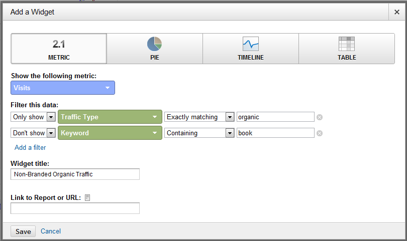
Widget #1: Total Organic Non-Branded Keyword Traffic (Metric/Timeline)

With this metric/timeline widget, we're simply wanting to look at our total number of organic, non-branded search traffic. Remember, with the metric widget, you can only look at a single metric. If you only want to see the total number of visits, add a metric widget. However, if you'd like to see the total visit count broken out over the selected date range, you'll want to add it as a timeline widget.

For this widget, we'll add a Metric/Timeline with the following dimensions:

Nonbranded Organic Traffic

Widget #2: Total Organic Non-Branded Keyword Conversions (Metric/Timeline)

In this widget we're looking to get a snapshot of just how many total conversions (or transactions) that have been generated by our non-branded organic keyword referrals.

For this widget, we'll add a Metric/Timeline with the following dimensions:

Non-Branded Organic Conversions

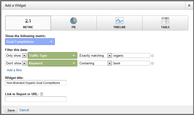
Just like before, if you'd prefer to see this over time you can change this widget to be a timeline instead of a metric widget.

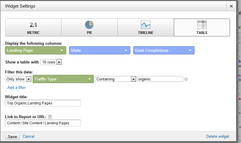
Widget #3: Total Organic Non-Branded Keyword Traffic (Table)

This widget filters out your branded search keyword referrals so you can get right to the keywords you're most interested in. You may also consider adding an additional filter to remove (not provided) if it takes up a significant number of the results.

For this widget, we'll add a Table with the following dimensions:

Non-Branded Organic Keywords

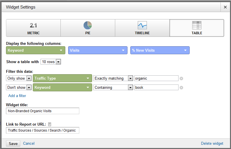
You'll notice that I didn't choose any goals for the secondary metric. We'll cover that in the next widget. For now, we want to get a good understanding of what keywords are driving

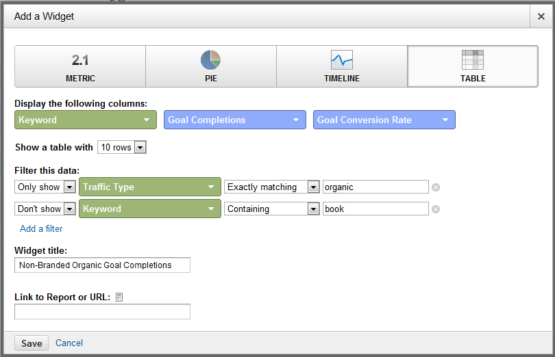
Widget #4: Total Organic Non-Branded Keyword Conversions/Transactions (Table)

In this widget we're looking to get a quick look at our top converting/transaction keywords. Once again, I recommend filtering out your branded search terms. Depending on how many important conversion points you want to keep track of, you may need to add more than one widget of this type because you can only view two metrics in each Table widget.

For this widget, we'll add a Table with the following dimensions:

Non-Branded Organic Keyword Conversions

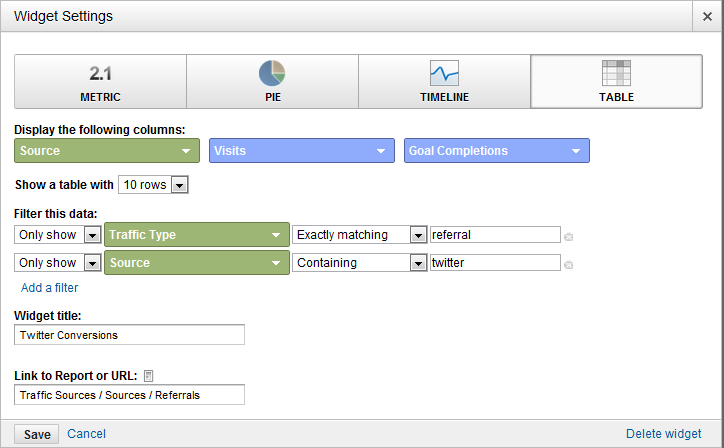
Widget #5: Top Social Action Content (Table)

You'll find it easier to navigate to this report in the Standard Reporting section of Google Analytics (Audience > Social > Pages) and adding the widget using the top navigation bar in Google Analytics. The goal of this particular widget is to quickly see which content on your site is getting shared the most in social media. That way you'll know what content topics have the best chance of going viral.

By default Google will show you information for only Google+, in a future post I'll walk you through how to get other sites like Twitter and Facebook setup on here, too.

If your blog content lives under a /blog/ subfolder, you may want to consider filtering the report to only look at that content.

For this widget, we'll add a Table with the following dimensions:

Social Action Content

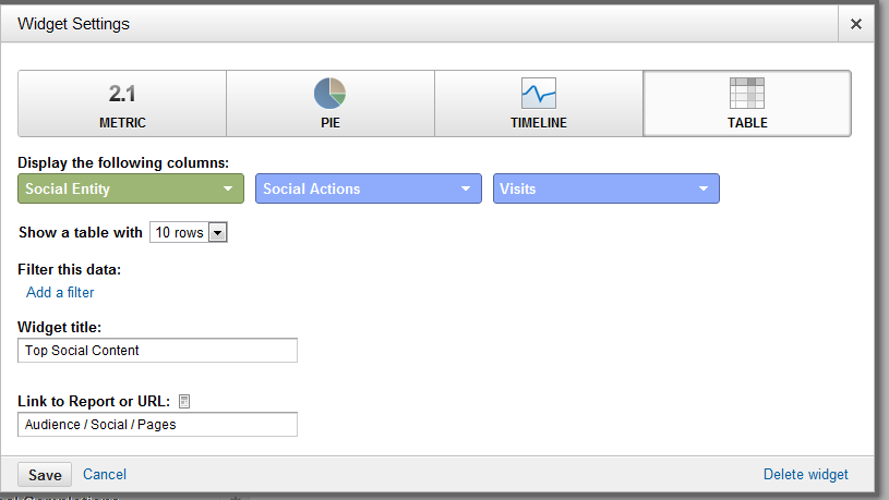
After I added the widget to our SEO Monitoring dashboard, I went back and edited it to also include total visits as well.

Widget #6: Top Content Traffic & Conversions (Table)

In addition to knowing what content is getting shared the most, I like to keep an eye on what blog content is getting the most traffic and conversions.

For this widget, we'll add a Table with the following dimensions:

Top Organic Landing Pages

Don't forget to filter in just your blog content if that is the area you want to focus on.

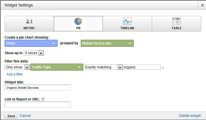
Widget #7: Organic Search Engine Referrals (Pie)

I like to keep an eye on which search engines are sending me traffic and how it changes over time. The best way to get a snapshot of this is to add a pie chart widget.

For this widget, we'll add a Pie with the following dimensions:

Search Engine Referrals

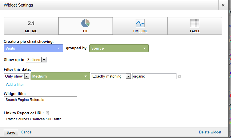
I chose to only look at the top three organic search engine referrals, but you can select up to six for your pie chart.

Widget #8: Page Load Speed (Table)

We also need to keep an eye on any pages that are loading slow. We can actually setup the widget to only look at organic traffic page load speeds, although it would be in your best interest to look at all your content, not just that just with organic visits.

For this widget, we'll add a Table with the following dimensions:

Page Load Speed

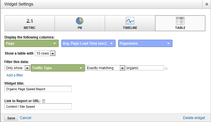
The above table shows you your top ten slowest loading landing pages, and also includes how many visits that pages receives. You can sort by either, but it's probably best to tackle the pages with the slowest load time first.

Widget #9: Site Search Keywords (Table)

The final piece to our monitoring puzzle: a list of keywords being searched for the most on our internal site search. This is a great way to generate new keyword ideas and to find new usability ideas (more on that later).

For this widget, we'll add a Table with the following dimensions:

Site Search

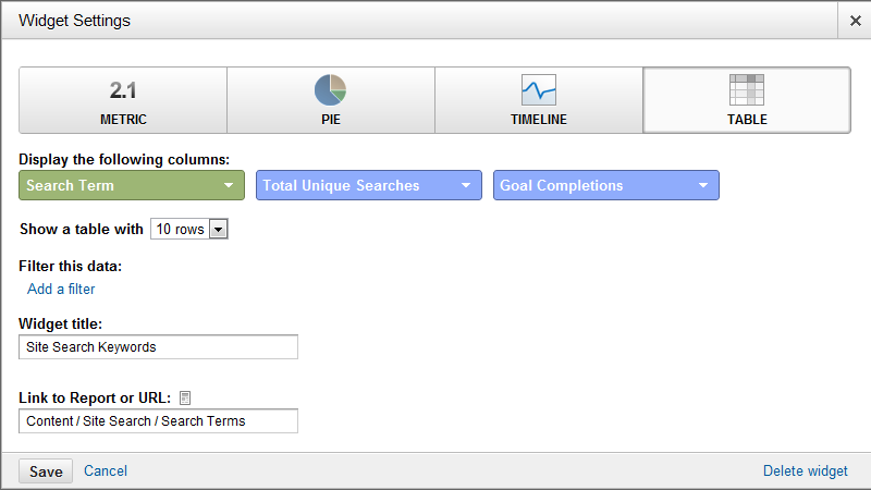
I also like to add conversions as a dimension to this widget so I can not only keep an eye on which terms are getting searched for the most, but also which lead to the most conversions.

Website Redesign Dashboard - SEO Focus

So it's time for the dreaded redesign process. You have a pretty good idea of what's ahead: long nights, lots of frustration and hopefully, a great looking website not too far down the line. With this dashboard you can quickly gain insight into what changes you should be making in the upcoming redesign to help out your SEO campaign.

You might also consider renaming this dashboard to be a Usability dashboard so you can frequently check-in on how well your site is performing for your visitors.

We'll be borrowing a few of the widgets in our SEO Monitoring dashboard, but also adding a few. Let's first look at which widgets we should be re-adding to this new dashboard:

Widget #1: Top Converting Keywords (SEO Monitoring Widget #2)

A website redesign offers a great opportunity for keyword inclusion throughout our site's architecture (navigation, URLs, etc.) With this widget we can keep an eye on which keywords we should be focusing these optimization efforts on.

Widget #2: Top Social Action Content (SEO Monitoring Widget #5)

Which social networks are engaging the most with your content? What pages are getting the most engagements? Answering these questions will help you create a user experience that is not only tailored to your top social network traffic drivers, but that also encourages social sharing.

You'll also want to look closely at what makes the content in this report so shareable. Is it because of the way they are laid out? The images they use? These insights can really help you carry that experience throughout your new site.

Widget #3: Top Converting Content (SEO Monitoring Widget #6)

Just like with the top social action content, you want to keep an eye on the content that is working best (and worst). This will allow you to duplicate your successes and (hopefully) eliminate your failures.

Widget #4: Page Load Speed (SEO Monitoring Widget #8)

The redesign is the perfect time to address page load speed problems. Take a look at the slowest rendering pages in this table and determine what the common problems are that are slowing the load speed down.

Widget #5: Site Search Keywords (SEO Monitoring Widget #9)

Site search is great for finding new keywords, it's also a great way to figure out what problems people are having navigating your site. With this widget you can quickly see the types of content people are expecting to find on your site - but aren't able to.

On to our new widgets!

Widget #6 & #7: SEO Geographic Summary (Table) & Language (Table)

Is it time to consider translating your site for a new geographic audience? This type of change will definitely need your attention as an SEO. It's also an opportunity for you to branch out your link building into new languages.

For this widget, we'll add a Table with the following dimensions:

Geographic Summary

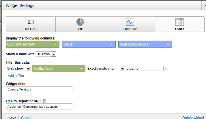
The organic traffic filter I have in place is definitely optional. I think it helps keep the data set you're looking at more consistent by restricting it to organic visits only like the other widgets are set to.

For the Language widget, we'll add a Table with the following dimensions:

Language Summary

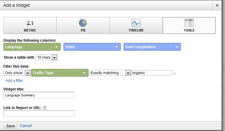
You'll note that I also filtered out all non-organic traffic here, too.

Widget #8: Top Exit/Bounce Pages (Table)

For this particular widget, we're once again trying to identify problem pages. Any pages that have a high exit/bounce rate should get a close review to see if the cause for people leaving can easily be identified.

For this widget, we'll add a Table with the following dimensions:

Exit and Bounces Summary

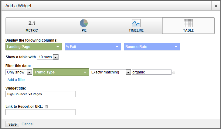
It's important that we filter out any blog content that naturally creates high bounce rates. If you also have an event like a Account Login on your site, you may wish to use Google's Event Tracking to filter out those visits as well.

Widget #9: Mobile Devices (Pie)

Which mobile devices are your visitors using to access your site? Are you getting a substantial number of visits? Do you anticipate it growing during the life of the next site design? More than likely this will be an area of focus for your redesign. It's important that you know exactly which devices your consumers are using to view your site so you can ensure compatibility.

For this widget, we'll add a Pie with the following dimensions:

Mobile Summary

Widget #10: Browser Conversion Rate (Table)

Finally, I like to take a look into what browser our visitors are using most, and what their conversion rate currently is. We all say we test all browsers for compatibility, but there are always pages that were rushed or that just fell through the cracks that might not be presenting themselves the way you had hoped.

For this widget, we'll add a Pie with the following dimensions:

Browsers Summary

Holistic Dashboard

It's no secret that to succeed in today's online marketing world you need to be doing more than just SEO. Not just from the sense that other marketing efforts can help drive in new leads, but because it helps your SEO campaign succeed.

This dashboard highlights how your PPC and social media efforts are performing, so you can take that information and apply it to your SEO campaigns.

Widget #1: Top Social Action Content (SEO Monitoring Widget #5)

This widget will allow us to keep track of what types of content are performing best from a social perspective.

Widget #2: Top Referral Conversion/Transaction Sources (Table)

Within this report we'll be able to quickly see which social networks are the most profitable in terms of conversions and/or actual transactions. This is a great way to see which social networks respond well to your offering, and that you should be investing more time in.

For this widget, we'll add a Table with the following dimensions:

Social Conversion Sources

Ideally you'll want to setup a filter to only look at social networks. If you're good about tagging your URLs with custom variables, then you can change the filter to look at the medium and enter the medium value you use for social URLs (example: social).

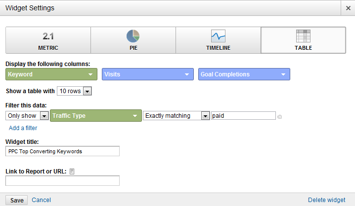
Widget #3: Top Paid Converting/Transaction Keywords (Table)

Ever since the (not provided) update, we've all lost out on valuable keyword data. But just as Google hoped we would, we can get this information from our PPC spend. With this widget we'll look at the keywords that are driving the most conversions/transactions for our PPC marketing, so we can look into targeting them in our SEO marketing, too.

For this widget, we'll add a Table with the following dimensions:

Top Paid Converting Keywords

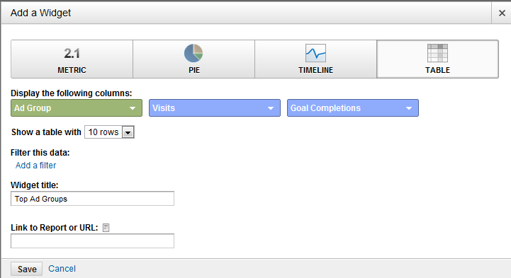
Widget #4: Top Paid Revenue Generating Ad Groups

Just like with our previous keyword widget, I also like to look at the top performing ad groups. This is a good way to know what top level topics are performing the best for your paid search campaigns, so you can prioritize them in your SEO campaigns.

For this widget, we'll add a Table with the following dimensions:

Top PPC Ad Groups

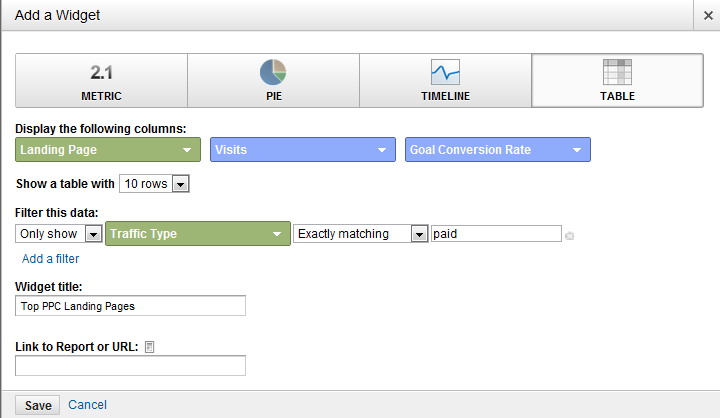
Widget #5: Top Paid Landing Pages (Table)

If you're not using custom landing pages for your paid search campaigns, this is a great way to see which keywords are working best for the various pages on your site. I like to run these types of tests before I commit to any keywords for SEO.

For this widget, we'll add a Table with the following dimensions:

Top Paid Landing Pages

That's just three of the 20 dashboards you could setup in Google Analytics. What are you adding to your dashboards to make them more actionable?

How Much is 1 Website Visitors Worth to You?

Part of the reason so many people beg, borrow, and steal for search engine traffic is because so many people have the same thin business models offering the same stuff. Rather than thinking of ways to differentiate or look within for ways to increase value, we figure just getting a couple more links will be all we need to do well. And it may be in the short term, but that is not enough to stay competitive.

Most websites are not set up to convert...even many well known sites ran by marketers (who should know better) do a poor job of converting. And improving conversion rates means you can buy more traffic or brand exposure (affiliates, AdSense, direct ads, paid search, partnerships, and public relations). When I changed the business model of this site there was an initial rush of sign ups, but then that fell off quickly. By spending a couple hours of research, writing, and marketing on this site I have since doubled the daily number of sales, not once, but twice.

At a minimum there are still 3 big holes in my sales process which need improved. But within another month or two I can see the daily rate of new sales with a recurring model exceeding the sales rate from a one off product that was sold at a cheaper price point. It almost seems criminal when you think how hard it is that we have to work to gain mindshare and marketshare, and then just throw away the value by not optimizing our sales process and sales funnels.

My wife is at a conversion conference hosted by these guys. Hopefully I can bug her to make a post or two about all the stuff she learns. And hopefully she can help double our daily conversions again, at least until we sell out.

Striving to be (Below) Average...

Google Analytics came out with a novel benchmarking feature which compares your site's performance to other websites in your field. You can see this benchmark data ONLY IF you are willing to aggregate your data into the pool of anonymized data.

The best sites in your industry probably are not using Google Analytics, and those who do are probably not benchmarking against average, so you are essentially benchmarking your site against a random sample of the bottom half of your industry. I guess such a measurement has purpose, unfortunately I fail to see it.

I hope that while so many people are out smelling the flowers, someone is taking the time to plant some. - Herbert Rappaport

Using Affiliate Software to Track Your Ads

Many people think of affiliates as an added sales channel and affiliate ads as offering a branding bonus (how many text link ads affiliate banner ads have you seen?) but there are numerous benefits to running an affiliate program that many people never consider.

Exclusive Partnerships:

You do not have to let people know that you have an affiliate program unless it makes sense to. You can chose what partners to allow when special occasions come up, without risking watering down your brand equity and perceived value by chasing large distribution deals.

Learn Market Research Data:

  • What ad formats work best?

  • What types of affiliate conversion work best?
  • Are there holes in your marketing?

Some affiliate software allows you to track affiliate lead sources and conversions so you can not only improve your own copy, but also improve your sales funnel and recommendations to affiliates based on real world data from top performers. Many affiliates will also uncover markets you never thought of.

Cloak Your Own Actions as an Affiliate:

If you are doing high risk ad buys it might make sense to sign up as your own affiliate and make it look like it was one of your affiliates who bought that keyword or ad.

KeyCompete and SpyFU make it easy to get an overview of competitive keyword buys. You can use different affiliate accounts for different ad campaigns to make easy for you to see your results while making it harder for anyone to use services like KeyCompete or SpyFU to track your advertisements, especially if you combine unique domains or subdomains from popular sites with php jump scripts for your ads.

Granular Centralized Tracking of Advertisements:

Know exactly where various ad networks are displaying your ads. Trach which ones convert and buy directly from the best sources, while filtering out low value sites or networks.