If you look just at your revenue numbers as a publisher, it is easy to believe mobile is of limited importance. In our last post I mentioned an AdAge article highlighting how the New York Times was generating over half their traffic from mobile with it accounting for about 10% of their online ad revenues.
Large ad networks (Google, Bing, Facebook, Twitter, Yahoo!, etc.) can monetize mobile *much* better than other publishers can because they aggressively blend the ads right into the social stream or search results, causing them to have a much higher CTR than ads on the desktop. Bing recently confirmed the same trend RKG has highlighted about Google's mobile ad clicks:
While mobile continues to be an area of rapid and steady growth, we are pleased to report that the Yahoo Bing Network’s search and click volumes from smart phone users have more than doubled year-over-year. Click volumes have generally outpaced growth in search volume
Those ad networks want other publishers to make their sites mobile friendly for a couple reasons...
If the downstream sites are mobile friendly, then users are more likely to go back to the central ad / search / social networks more often & be more willing to click out on the ads from them.
If mobile is emphasized in importance, then those who are critical of the value of the channel may eat some of the blame for relative poor performance, particularly if they haven't spent resources optimizing user experience on the channel.
Starting April 21, we will be expanding our use of mobile-friendliness as a ranking signal. This change will affect mobile searches in all languages worldwide and will have a significant impact in our search results.
In the past Google would hint that they were working to clean up link spam or content farms or website hacking and so on. In some cases announcing such efforts was done to try to discourage investment in the associated strategies, but it is quite rare that Google pre-announces an algorithmic shift which they state will be significant & they put an exact date on it.
I wouldn't recommend waiting until the last day to implement the design changes, as it will take Google time to re-crawl your site & recognize if the design is mobile friendly.
Those who ignore the warning might be in for significant pain.
Some sites which were hit by Panda saw a devastating 50% to 70% decline in search traffic, but given how small mobile phone screen sizes are, even ranking just a couple spots lower could cause an 80% or 90% decline in mobile search traffic.
Another related issue referenced in the above post was tying in-app content to mobile search personalization:
Starting today, we will begin to use information from indexed apps as a factor in ranking for signed-in users who have the app installed. As a result, we may now surface content from indexed apps more prominently in search. To find out how to implement App Indexing, which allows us to surface this information in search results, have a look at our step-by-step guide on the developer site.
Some sites have a separate m. version for mobile visitors, while other sites keep consistent URLs & employ responsive design. How the m. version works is on the regular version of their site (say like www.seobook.com) a webmaster could add an alternative reference to the mobile version in the head section of the document
<link rel="alternate" media="only screen and (max-width: 640px)" href="http://m.seobook.com/" >
...and then on the mobile version, they would rel=canonical it back to the desktop version, likeso...
With the above sort of code in place, Google would rank the full version of the site on desktop searches & the m. version in mobile search results.
3 or 4 years ago it was a toss up as to which of these 2 options would win, but over time it appears the responsive design option is more likely to win out.
2017 Update: Google confirmed in June of 2017 they prefer responsive designs, as in 2018 they intend to move to a mobile-first index of the web. In the past the m. version was simply a relational pointer, but when the mobile version of a page becomes the default version of a page, then if it lacks content that was on the desktop version of the page that missing content will not be in the search index on mobile or desktop.
Here are a couple reasons responsive is likely to win out as a better solution:
If people share a mobile-friendly URL on Twitter, Facebook or other social networks & the URL changes, then when someone on a desktop computer clicks on the shared m. version of the page with fewer ad units & less content on the page, then the publisher is providing a worse user experience & is losing out on incremental monetization they would have achieved with the additional ad units.
While some search engines and social networks might be good at consolidating the performance of the same piece of content across multiple URL versions, some of them will periodically mess it up. That in turn will lead in some cases to lower rankings in search results or lower virality of content on social networks.
Over time there is an increasing blur between phones and tablets with phablets. Some high pixel density screens on cross over devices may appear large in terms of pixel count, but still not have particularly large screens, making it easy for users to misclick on the interface.
When Bing gave their best practices for mobile, they stated: "Ideally, there shouldn’t be a difference between the “mobile-friendly” URL and the “desktop” URL: the site would automatically adjust to the device — content, layout, and all." In that post Bing shows some examples of m. versions of sites ranking in their mobile search results, however for smaller & lesser known sites they may not rank the m. version the way they do for Yelp or Wikipedia, which means that even if you optimize the m. version of the site to a great degree, that isn't the version all mobile searchers will see. Back in 2012 Bing also stated their preference for a single version of a URL, in part based on lowering crawl traffic & consolidation of ranking signals.
In addition to responsive web design & separate mobile friendly URLs, a third configuration option is dynamic serving, which uses the Vary HTTP header to detect the user-agent & use that to drive the layout. For large, complex & high-traffic sites (and sites with numerous staff programmers & designers) dynamic serving is perhaps the best optimization solution because you can optimize the images and code to lower bandwidth costs and response times. Most smaller sites will likely rely on responsive design rather than dynamic serving, in large part because it is quicker & cheaper to implement, and most are not running sites large enough to where the incremental bandwidth provides a significant incremental expense to their business.
Solutions for Quickly Implementing Responsive Design
New Theme / Design
If your site hasn't been updated in years you might be suprised at what you find available on sites like ThemeForest for quite reasonable prices. Many of the options are responsive out of the gate & look good with a day or two of customization. Theme subscription services like WooThemes and Elegant Themes also have responsive options.
Some of the PSD to HTML conversion services like PSD 2 HTML, HTML Slicemate & XHTML Chop offer responsive design conversion of existing HTML sites in as little as a day or two, though you will likely need to do at least a few minor changes when you put the designs live to compensate for issues like third party ad units and other minor issues.
If you have an existing Wordpress theme, you might want to see if you can zip it up and send it to them, or else they may make your new theme as a child theme of 2015 or such. If you are struggling to get them to convert your Wordpress theme over (like they are first converting it to a child theme of 2015 or such) then another option would be to have them do a static HTML file conversion (instead of a Wordpress conversion) and then feed that through a theme creation tool like Themespress.
For simple hand rolled designs there are a variety of grid generator tools, which can make it reasonably easy to replace some old school table-based designs with divs. Many of the themes for sale in marketplaces like Theme Forest also use a multi-column div grid based system.
Other Things to Look Out For
Third Party Plug-ins & Ad Code Gotchas
Google allows webmasters to alter the ad calls on their mobile responsive AdSense ad units to show different sized ad units to different screen sizes & skip showing some ad units on smaller screens. An AdSense code example is included in an expandable section at the bottom of this page.
For other ads which perhaps don't have a "mobile friendly" option you could use CSS to either set the ad unit to display none or to set the ad unit to overflow using code like either of the following
hide it:
@media only screen and (max-width: ___px) {
.bannerad {
display: none;
}
}
overflow it:
@media only screen and (max-width: ___px) {
.ad-unit {
max-width: ___px;
overflow: scroll;
}
}
Back up your old site before putting the new site live.
For static HTML sites or sites with PHP or SHTML includes & such...
Download a copy of your existing site to local.
Rename that folder to something like sitename.com-OLDVERSION
Upload the sitename.com-OLDVERSION folder to your server. If anything goes drastically wrong during your conversion process you can rename the new site design to something like sitename.com-HOSED then set the sitename.com-OLDVERSION folder to sitename.com to quickly restore the site.
Download your site to local again.
Ensure your new site design is using a different CSS folder or CSS filename such that they old and new versions of the design can be live at the same time while you are editing the site.
Create a test file with the responsive design on your site & test that page until things work well enough.
Once you have the general "what needs changed in each file" down, then use find & replace to bulk edit the remaining files to make the changes to make them responsive.
Use a tool like FileZilla to quickly bulk upload the files.
Look through key pages and if there are only a few minor errors then fix them and re-upload them. If things are majorly screwed up then revert to the old design being live and schedule a do over on the upgrade.
If you have a decently high traffic site, it might make sense to schedule the above process for late Friday night or an off hour on the weekend, such that if anything goes astray you have fewer people seeing the errors while you frantically rush to fix them. :)
If you want to view your top pages you could export that data from your web analytics to verify all those pages look good. If you wanted to view every page of your site 1 at a time after the change, you could use a tool like Xenu Link Sleuth or Screaming Frog SEO Spider to crawl your site & export a list of URLs into a spreadsheet. Then you could take the URLs from that spreadsheet and put them a chunk at a time into a tool like URL Opener.
If you have little faith in the above test-it-live "methodology" & would prefer a slower & lower stress approach, you could create a test site on another domain name for testing purposes. Just be sure to include a noindex directive in the robots.txt file or password protect access to the site while testing. When you get things worked out on it, make sure your internal links are referencing the correct domain name, and that you have removed any block via robots.txt or password protection.
For a site with a CMS the above process is basically the same, except for how you might need to create a different backup. If you are uploading a Wordpress or Drupal theme, then change the name at least slightly so you can keep the old and new designs live at the same time so you can quickly switch back to the old design if you need to.
If you have a mixed site with Wordpress & static files or such then it might make sense to test changing the static files first, get those to work well & then create a Wordpress theme after that.
Google systems have tested 2,790 pages from your site and found that 100% of them have critical mobile usability errors. The errors on these 2,790 pages severely affect how mobile users are able to experience your website. These pages will not be seen as mobile-friendly by Google Search, and will therefore be displayed and ranked appropriately for smartphone users.
When Google introduced the knowledge graph one of their underlying messages behind it was "you can't copyright facts."
Facts are like domain names or links or pictures or anything else in terms of being a layer of information which can be highly valued or devalued through commoditization.
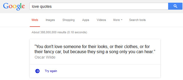
When you search for love quotes, Google pulls one into their site & then provides another "try again" link.
Since quotes mostly come from third parties they are not owned by BrainyQuotes and other similar sites. But here is the thing, if those other sites which pay to organize and verify such collections have their economics sufficiently undermined then they go away & then Google isn't able to pull them into the search results either.
The same is true with song lyrics. If you are one of the few sites paying to license the lyrics & then Google puts lyrics above the search results, then the economics which justified the investment in licensing might not back out & you will likely go bankrupt. That bankruptcy wouldn't be the result of being a spammer trying to work an angle, but rather because you had a higher cost structure from trying to do things the right way.
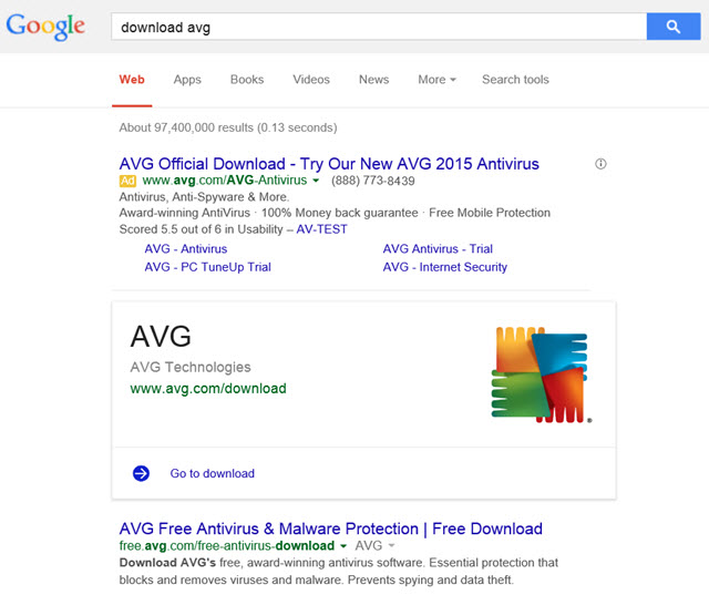
Google has also done the above quote-like "action item" types of onebox listings in other areas like software downloads
Where there are multiple versions of the software available, Google is arbitrarily selecting the download page, even though a software publisher might have a parallel SAAS option or other complex funnels based on a person's location or status as a student or such.
Mix in Google allowing advertisers to advertise bundled adware, and it becomes quite easy for Google to gum up the sales process and undermine existing brand equity by sending users to the wrong location. Here's a blog post from Malwarebytes referencing
their software being advertised on their brand term in Google via AdWords ads, engaging in trademark infringement and bundled with adware.
numerous user complaints they received about the bundleware
required legal actions they took to take the bundler offline
The company used this cash to build more business, spending more than $1 million through at least seven separate advertising accounts with Google.
...
The ads themselves said things like “McAfee Support - Call +1-855-[redacted US phone number]” and pointed to domains like mcafee-support.pccare247.com.
...
One PCCare247 ad account with Google produced 71.7 million impressions; another generated 12.4 million more. According to records obtained by the FTC, these combined campaigns generated 1.5 million clicks
Since Google requires Chrome extensions be installed from their own website it makes it hard (for anyone other than Google) to monetize them, which in turn makes it appealing for people to sell the ad-ons to malware bundlers. Android apps in the Google Play store are yet another "open" malware ecosystem.
FACT: This Isn't About Facts
Google started the knowledge graph & onebox listings on some utterly banal topics which were easy for a computer to get right, though their ambitions vastly exceed the starting point. The starting point was done where it was because it was low-risk and easy.
When Google's evolving search technology was recently covered on Medium by Steven Levy he shared that today the Knowledge Graph appears on roughly 25% of search queries and that...
Google is also trying to figure out how to deliver more complex results — to go beyond quick facts and deliver more subjective, fuzzier associations. “People aren’t interested in just facts,” she says. “They are interested in subjective things like whether or not the television shows are well-written. Things that could really help take the Knowledge Graph to the next level.”
Even as the people who routinely shill for Google parrot the "you can't copyright facts" mantra, Google is telling you they have every intent of expanding far beyond it. “I see search as the interface to all computing,” says Singhal.
Even if You Have Copyright...
What makes the "you can't copyright facts" line so particularly disingenuous was Google's support of piracy when they purchased YouTube:
cofounder Jawed Karim favored “lax” copyright policy to make YouTube “huge” and hence “an excellent acquisition target.” YouTube at one point added a “report copyrighted content” button to let users report infringements, but removed the button when it realized how many users were reporting unauthorized videos. Meanwhile, YouTube managers intentionally retained infringing videos they knew were on the site, remarking “we should KEEP …. comedy clips (Conan, Leno, etc.) [and] music videos” despite having licenses for none of these. (In an email rebuke, cofounder Steve Chen admonished: “Jawed, please stop putting stolen videos on the site. We’re going to have a tough time defending the fact that we’re not liable for the copyrighted material on the site because we didn’t put it up when one of the co-founders is blatantly stealing content from other sites and trying to get everyone to see it.”)
To some, the separation of branding makes YouTube distinct and separate from Google search, but that wasn't so much the case when many sites lost their video thumbnails and YouTube saw larger thumbnails on many of their listings in Google. In the above Steven Levy article he wrote: "one of the highest ranked general categories was a desire to know “how to” perform certain tasks. So Google made it easier to surface how-to videos from YouTube and other sources, featuring them more prominently in search."
Altruism vs Disruption for the Sake of it
Whenever Google implements a new feature they can choose to not monetize it so as to claim they are benevolent and doing it for users without commercial interest. But that same unmonetized & for users claim was also used with their shopping search vertical until one day it went paid. Google claimed paid inclusion was evil right up until the day it claimed paid inclusion was a necessity to improve user experience.
There was literally no transition period.
Many of the "informational" knowledge block listings contain affiliate links pointing into Google Play or other sites. Those affiliate ads were only labeled as advertisements after the FTC complained about inconsistent ad labeling in search results.
starting in the next few days, when you ask Google about common health conditions, you’ll start getting relevant medical facts right up front from the Knowledge Graph. We’ll show you typical symptoms and treatments, as well as details on how common the condition is—whether it’s critical, if it’s contagious, what ages it affects, and more. For some conditions you’ll also see high-quality illustrations from licensed medical illustrators. Once you get this basic info from Google, you should find it easier to do more research on other sites around the web, or know what questions to ask your doctor.
Google's links to the Mayo Clinic in their knowledge graph are, once again, a light gray font.
In case you didn't find enough background in Google's announcement article, Greg Sterling shared more of Google's views here. A couple notable quotes from Greg...
Cynics might say that Google is moving into yet another vertical content area and usurping third-party publishers. I don’t believe this is the case. Google isn’t going to be monetizing these queries; it appears to be genuinely motivated by a desire to show higher-quality health information and educate users accordingly.
Google doesn't need to directly monetize it to impact the economics of the industry. If they shift a greater share of clicks through AdWords then that will increase competition and ad prices in that category while lowering investment in SEO.
If this is done out of benevolence, it will appear *above* the AdWords ads on the search results — unlike almost every type of onebox or knowledge graph result Google offers.
If it is fair for him to label everyone who disagrees with his thesis as a cynic then it is of course fair for those "cynics" to label Greg Sterling as a shill.
Google told me that it hopes this initiative will help motivate the improvement of health content across the internet.
By defunding and displacing something they don't improve its quality. Rather they force the associated entities to cut their costs to try to make the numbers work.
If their traffic drops and they don't do more with less, then...
their margins will fall
growth slows (or they may even shrink)
their stock price will tank
management will get fired & replaced and/or they will get took private by private equity investors and/or they will need to do some "bet the company" moves to find growth elsewhere (and hope Google doesn't enter that parallel area anytime soon)
Things get monetized directly, monetized indirectly, or they disappear.
Some of the more hated aspects of online publishing (headline bait, idiotic correlations out of context, pagination, slideshows, popups, fly in ad units, auto play videos, full page ad wraps, huge ads eating most the above the fold real estate, integration of terrible native ad units promoting junk offers with shocking headline bait, content scraping answer farms, blending unvetted user generated content with house editorial, partnering with content farms to create subdomains on trusted blue chip sites, using Narrative Science or Automated Insights to auto-generate content, etc.) are not done because online publishers want to be jackasses, but because it is hard to make the numbers work in a competitive environment.
At The New York Times, for instance, more than half its digital audience comes from mobile, yet just 10% of its digital-ad revenue is attributed to these devices.
If we lose some diversity in news it isn't great, though it isn't the end of the world. But what makes health such an important area is it is literally a matter of life & death.
@johnandrews@aaronwall it must be nice to say, you know what we're keeping that traffic for ourselves, and nobody says a damn thing— Michael Gray (@graywolf) February 10, 2015
... and, only those who hate free speech, capitalism, democracy & the country could possibly have anything negative to say about it. :D
Not to worry though. Any user trust built through the health knowledge graph can be monetized through a variety of other fantastic benevolent offers.

