How To Make Awesome Landing Pages for Local PPC
Am I the only one who gets a warm, fuzzy feeling from a well-crafted, super-targeted landing page? Right, I didn't think so :)
Landing pages tend to suck more often than they inspire.
Local landing pages are even worse in many cases; with hapless advertisers throwing Google AdWords coupons away by simply sending you to their home page for every single ad :(
Why Local PPC Matters
I firmly believe that local PPC (and SEO) is still an untapped resource for those looking to make client work a part of their business portfolio.
It's quite hard enough for a local business owner, specifically one who has little experience in web marketing, to be expected to get a 75$ AdWords coupon and magically turn that into a quality PPC campaign that lasts.
Google tried that mass approach to marketing and failed. The result of that failure has brought about things like:
- Google Engage for Agencies
- Google Offers (with some of the Groupon fail mixed in on this one)
Google recognizes the market for helping small businesses reach customers on the web as do Groupon, Restaurant.Com, and all their clones.
Local PPC, especially when used in conjunction with local SEO, can really make significant differences at the local business level and many of those businesses need help to do it.
Landing Page Quality Matters
I really dislike hitting a generic landing page after I make a really specific query. It's kind of like going to Disney and asking where Space Mountain is, only to be told that "we have lots of attractions sir, here is a map of the entire resort".
Generally speaking, I believe most people like being led around by the nose. People typically want things yesterday so it's your job to give them exactly what they are looking for; after all, is that the point of search?
I think anyone who's worked with PPC campaigns can attest to the fact that targeted landing pages are quite high on the importance totem pole. Tailoring your landing pages to your target market matters a lot.
Solid Local PPC Landing Pages
Designing a good landing page for local queries is not hard at all. There are many different layouts you can use and you should test as many as is practicable, relative to your traffic levels, to understand which ones will work for you.
One area where local PPC is ripe for local business owners is insurance. I'm going to share a good example of a local lander below but if you are doing local PPC, before you get to the landing page design, utilize Google's address links like this advertiser did (green arrow mine)
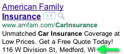
The above can help you stand out from the crowd where you are one the few local advertisers and it helps create that local experience right from the start.
So I came across a couple of examples of good ways to tie in local content with your landing page design.
Here's one from the insurance industry targeting terms around "wisconsin car insurance" followed by some tips on why I feel it's a good example (green arrows are mine):
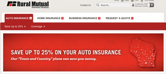
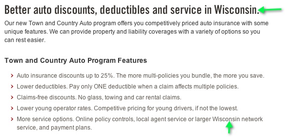
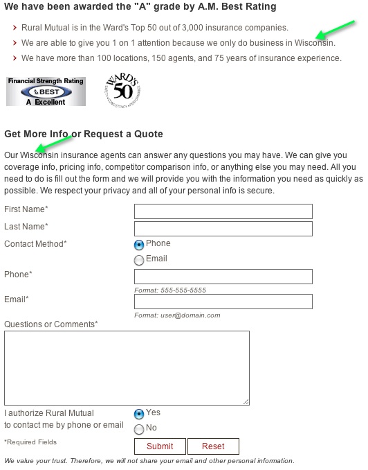
Why is this a good example?
- Use of the local modifier in key spots (doesn't appear stuffed)
- The Wisconsin Badger college football team's main color is red (not sure if that factored in but it helps to tie stuff like that in)
- Icon of the state in the main header
- Good use of badges to display authority in the insurance niche
- Lack of other navigation options, focused on the offer and the benefits of using their service
- I might have bolded "we only do business in Wisconsin" though
In the above example you see a problem with many insurance agents locally though, quite a few do not have the ability to offer live quotes so they have to use a contact form. In a web of instant gratification this is something that can be an issue.
Any good example is in another area where local customization works well, travel!:
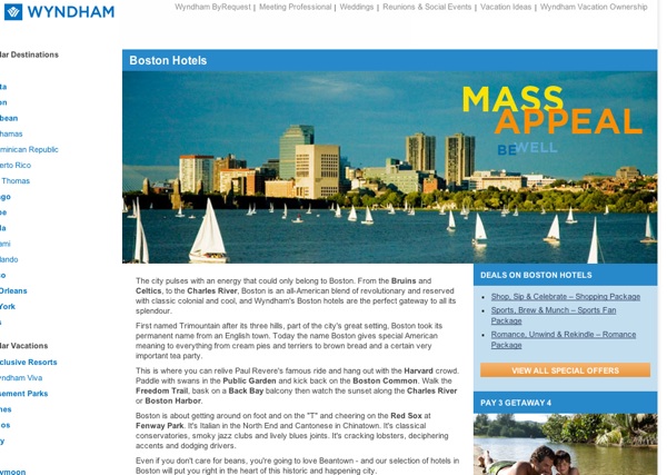
This was for a search around the keyword "boston hotels". The imagery is great here. A couple things I would have done would have been to eliminate the left navigation and make the main content area more bullet-point oriented rather than a set of paragraphs.
Overall, they have a set up here where they can do the same approach across a bunch of different locations.
Not So Solid Local PPC Landing Pages
While searching for the above examples I also found some that were examples of being really untargeted approaches to local keywords. Here's an example of a brand just throwing out a really basic lander:
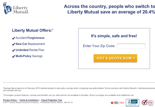
Absolutely no local customization at all. Good landing page basics though (clear CTA, clear benefits). Perhaps bigger brands don't need to, or fail to see the value in, making landing pages local-specific on local queries.
Liberty has no excuse not to either. They have local offices in every state, they could easily make their pages more local but they, for whatever reason, choose not to.
In keeping with the same theme, I found this landing page for "boston hotels" to be underwhelming at best:
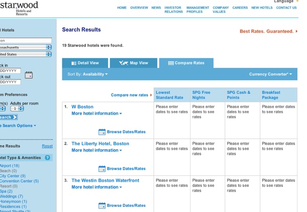
It's a list of information in an otherwise coldly designed table. Perhaps this works well enough, just give people the info I suppose.
As a user, especially if I'm traveling, I'd like to see pictures, brief info about the area, why choose here over the hundreds of other providers, etc.
Quality Landing Page Foundations
Typically, I would recommend starting out with a base layout and designing the page according to your market and then layering on local criteria. If you look at examples of good landing pages the layouts themselves don't change all that much.
Some local elements you can include are:
- Local imagery
- Locations and hours
- Integrated map with directions
- Proximity to local landmarks (good for things like hotels, bed and breakfasts, etc)
- Local phone number and contact information
- Membership in any local group (rotary club logo, Better Business Bureau, chamber of commerce logo, logos of local charities or events you are involved with, etc)
As discussed before, design should also speak to your audience (more tech savvy or less tech savvy, age, gender, market, and so on).
Consider these 2 examples of landing pages for online invoicing. This is a market where design should be fresh, modern, "web X.X" if you will (like market leader Freshbooks).
Here's a win for good landing page design:
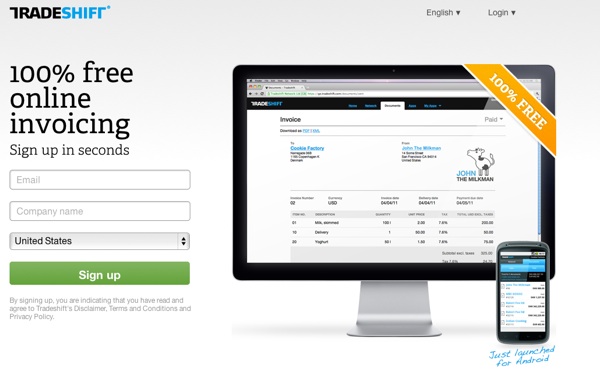
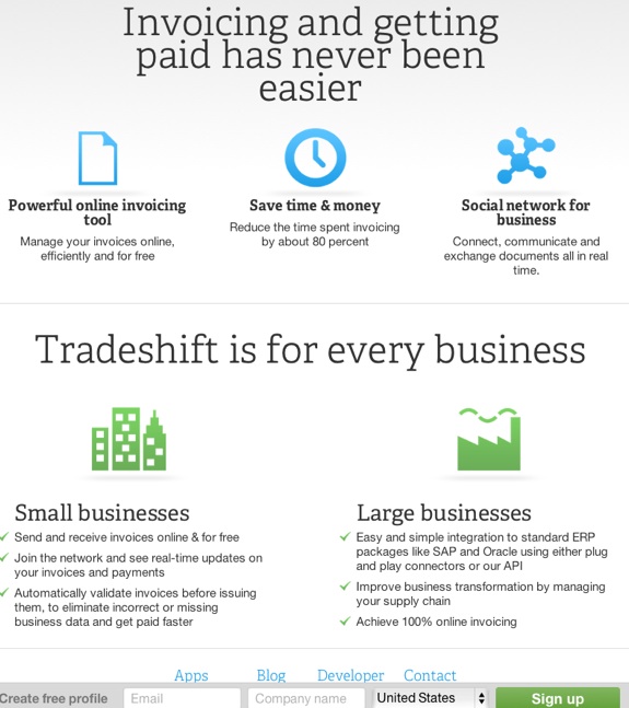
I really like the free sign up bar at the bottom. Your call to action is always available if you have to scroll or not. Good use of headlines, solid list of benefits, and super-easy sign up.
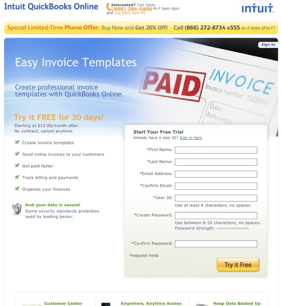
Compare that to something like Quickbooks which requires quite a bit of info to get started:
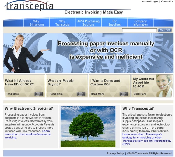
Then you have another example of, usually, what not to do. Too many navigation options here, run on paragraphs, lack of bullet points, outdated design for this market in my opinion:
So the layouts don't change drastically and I'd recommend coming up with a layout first, a base design, and base copy. Then you can easily turn any landing page into a targeted, local page pretty quickly with small design and copy tweaks.
Landing Page Resources
A few places I have bookmarked for landing page references are:
- PPC Blog's landing page section of the blog
- Unbounce's write up on 10 landing pages that don't suck (their landing page section is good as well)
- Copyblogger's section on landing pages
- Not a bookmark, but a recommend Tim Ash's book on landing page optimization
A couple of tools to help you with cranking out solid landing pages would be:
- Unbounce (hosted)
- Premise (Wordpress plugin from Copyblogger which comes with a ton of custom graphics and built in copywriting advice + tips)
It's not that difficult to create awesome, locally targeted landing pages. It's a really simple process:
- Check out the resources linked to above and make a swipe file of nicely designed landing pages (design and layout)
- Incorporate the base layout and copy layout (headings, graphics, CTA's, etc) into a wireframe
- Minimize distractions (focus on getting the clicker to complete the desired task)
- Get the UI and graphics in order
- Think about all the ways you can sprinkle in a local feel to the page, like we talked about above (colors, locations, hours, local connections, imagery, and so on)
- Add in the local components to your base page
What are some of your best practices when putting together landing pages for local PPC campaigns or landing page tips in general?


Comments
I'm quite pleased with the information provided by you. I too think that, The best way to get an awesome landing for a PPC page is; through Good Quality Content, Easy Available, Not to Costly, Self Explainatory & last not the least Targeting Consumer's Interest. Thanks For providing Information.
The post is quite long but it's worth it. I've been doing PPC for more than 3 years and I must say that the "Elements of Quality Landing Page" that you mentioned above is of the best techniques in local PPC.
Add new comment