Information is a commodity. Corporations are passing around consumer behavioral profiles like brokers with stocks, and the vast majority of the American public is none the wiser of this market’s scope. Very few people actually check the permissions portion of the Google Play store page before downloading a new app, and who has time to pore over the tedious 48-page monstrosity that is the iTunes terms and conditions contract?
With the advent of wearables, ubiquitous computing, and widespread mobile usage, the individual’s market share of their own information is shrinking at an alarming rate. In response, a growing (and vocal) group of consumers is voicing its concerns about the impact of the effective end of privacy online. And guess what? It’s up to designers to address those concerns in meaningful ways to assuage consumer demand.
But how can such a Sisyphean feat be managed? In a world that demands personalized service at the cost of privacy, how can you create and manage a product that strikes the right balance between the two?
That’s a million dollar question, so let’s break it into more affordable chunks.
Transparency
The big problem with informed consent is the information. It’s your responsibility to be up front with your users as to what exactly they’re trading you in return for your product/service. Not just the cash flow, but the data stream as well. Where’s it going? What’s it being used for?
99.99% of all smartphone apps ask for permission to modify and delete the contents of a phone’s data storage. 99.9999% of the time that doesn’t mean it’s going to copy and paste contact info, photos, or personal correspondences. But that .0001% is mighty worrisome.
Let your users know exactly what you’re asking from them, and what you’ll do with their data. Advertise the fact that you’re not sharing it with corporate interests to line your pockets. And if you are, well, stop that. It’s annoying and you’re ruining the future.
How can you advertise the key points of your privacy policies? Well, you could take a cue from noted online retailer Zappos.com. Their “PROTECTING YOUR PERSONAL INFORMATION” page serves as a decent template for transparency.
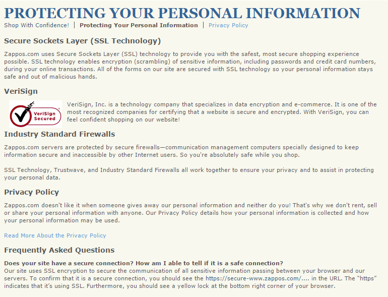
They have clearly defined policies about what they will and won’t do to safeguard shopper information. For one, they promise never to “rent, sell or share” user data to anyone, and immediately below, they link to their privacy policy, which weighs in a bit heavy at over 2500 words, but is yet dwarfed by other more convoluted policies.
They also describe their efforts to safeguard user data from malicious hacking threats through the use of SSL tech and firewalls. Then they have an FAQ addressing commonly expressed security concerns. Finally, they have a 24/7 contact line to assure users of personal attention to their privacy queries.
Now it should be noted that this is a template for a good transparency practices, and not precisely a great example of it. The content and intention is there, so what’s missing?
Good UX.
The fine print is indeed a little too fine, the text is a bit too dense (at least where the actual privacy policy is concerned), and the page itself is buried within the fat footer on the main page.
So who does a better job?
CodePen has actually produces an attractively progressive solution.
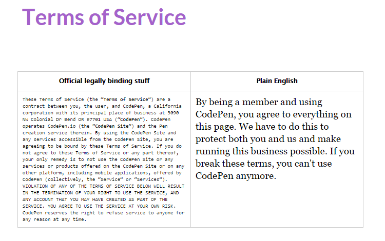
As you can see, CodePen has taken the time to produce two different versions of their ToS. A typical, lengthy bit of legalese on the left, and an easily readable layman’s version on the right. Providing these as a side by side comparison shows user appreciation and an emphasis on providing a positive UX.
This is all well and good for the traditional web browsing environment, but most of the problems with privacy these days stem from mobile usage. Let’s take a look at how mobile applications are taking advantage of the lag between common knowledge and current technology to make a profit off of private data.
Mobile Permissions
In the mobile space, the Google Play store does a decent job of letting users know what permissions they’re giving, whenever they download an app with its “Permission details” tab:
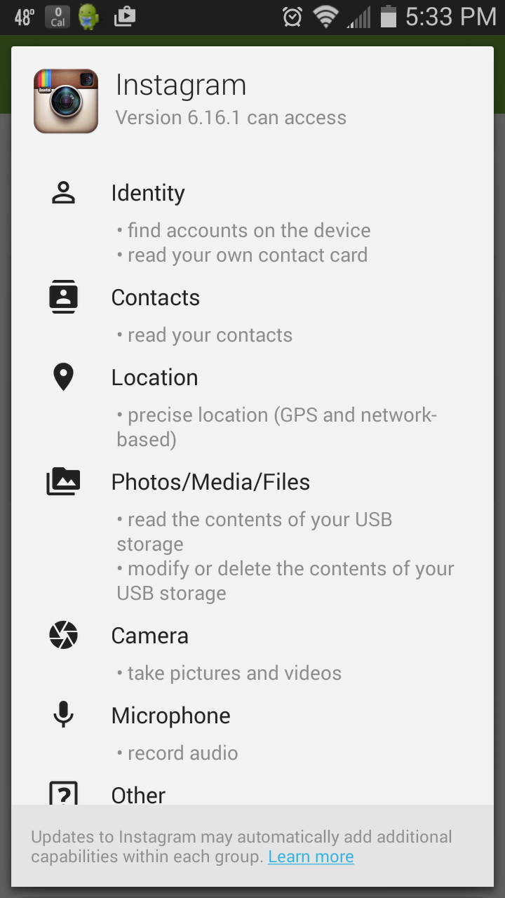
As you can see, Instagram is awfully nosy, but that’s no surprise. Instagram has come under fire for their privacy policies before. What’s perhaps more surprising, is the unbelievable ubiquity with which invasive data gathering is practiced in the mobile space. Compare Instagram’s permissions to another popular application you might have added to your smartphone’s repertoire:
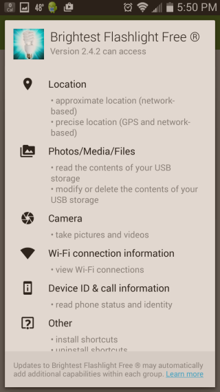
Why, pray tell, does a flashlight have any need for your location, photos/media/files, device ID and/or call information? I’ll give you a clue: it doesn’t.
“Brightest Flashlight Free” scoops up personal data and sells it to advertisers. The developer was actually sued in 2013 for having a poorly written privacy policy. One that did not disclose the apps malicious intentions to sell user data.
Now the policy is up to date, but the insidious data gathering and selling continues. Unfortunately, it isn’t the only flashlight application to engage in the same sort of dirty data tactics. The fact is, you have to do a surprising amount of research to find any application that doesn’t grab a bit more data than advertised, especially when the global market for mobile-user data approaches nearly $10 billion.
For your peace of mind, there is at least one example of an aptly named flashlight application which doesn’t sell your personal info to the highest bidder.
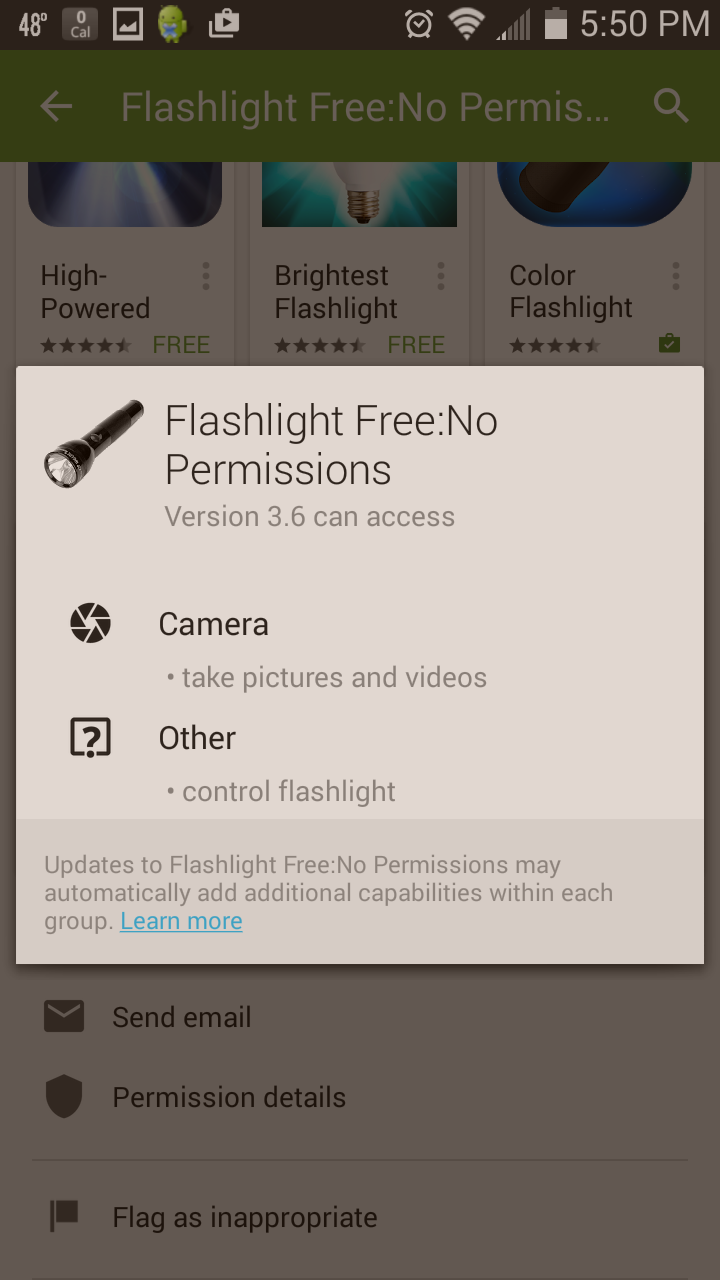
But don’t get too enthusiastic just yet. This is just one application. How many do you have downloaded on your smartphone? Chances are pretty good that you’re harboring a corporate spy on your mobile device.
Hell, even the Holy Bible takes your data:
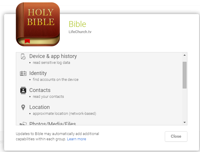
Is nothing sacred? To the App developer’s credit, they’ve expressed publicly that they’ll never sell user data to third party interests, but it’s still a wakeup call.
Privacy and UX
What then, are some UX friendly solutions? Designers are forced to strike a balance. Apps need data to run more efficiently, and to better serve users. Yet users aren’t used to the concerns associated with the wholesale data permissions required of most applications. What kind of design patterns can be implemented to bring in a bit of harmony?
First and foremost, it’s important to be utilitarian in your data gathering. Offering informed consent is important, letting your users know what permissions they’re granting and why, but doing so in performant user flows is paramount.
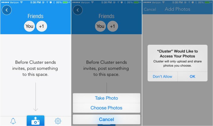
For example, iOS has at least one up on Android with their “dynamic permissions.” This means iOS users have the option of switching up their permissions in-app, rather than having to decide all or nothing upon installation as with Android apps.
http://techcrunch.com/2014/04/04/the-right-way-to-ask-users-for-ios-permissions/
Note how the Cluster application prompts the user to give access to their photos as their interacting with the application, and reassures them of exactly what the app will do. The user is fully informed, and offers their consent as a result of being asked for a certain level of trust.
All of this is accomplished while they’re aiming to achieve a goal within the app. This effectively moves permission granting to 100% because the developers have created a sense of comfort with the application’s inner workings. That’s what designing for privacy is all about: slowly introducing a user to the concept of shared data, and never taking undue advantage of an uninformed user.
Of course, this is just one facet of the privacy/UX conversation. Informing a user of what they’re allowing is important, but reassuring them that their data is secure is even more so.
Safeguarding User Data
Asking a user to trust your brand is essential to a modern business model, you’re trying to engender a trust based relationship with all of your visitors, after all. The real trick, however, is convincing users that their data is safe in your hands—in other words, it won’t be sold to or stolen by 3rd parties, be they legitimate corporations or malicious hackers.
We touched on this earlier with the Zappos example. Zappos reassures its shoppers with SSL, firewalls, and a personalized promise never to share or sell data. All of which should be adopted as industry standards and blatantly advertised to assuage privacy concerns.
Building these safeguards into your service/application/website/what-have-you is extremely important. To gain consumer trust is to first provide transparency in your own practices, and then to protect your users from the wolves at the gate.
Fortunately, data protection is a booming business with a myriad of effective solutions currently in play. Here are just a few of the popular cloud-based options:
Whatever security solutions you choose, the priorities remain the same. Build trust, and more importantly: actually deserve whatever trust you build.
It hardly needs to be stated, but the real key to a future where personal privacy still exists, is to actually be better people. The kind that can be trusted to hold sensitive data.
Is such a future still possible? Let us know what you think in the comment section.
Kyle Sanders is a member of SEOBook and founder of Complete Web Resources, an Austin-based SEO and digital marketing agency.


